Be yourself; Everyone else is already taken.
— Oscar Wilde.
This is the first post on my new blog. I’m just getting this new blog going, so stay tuned for more. Subscribe below to get notified when I post new updates.
Be yourself; Everyone else is already taken.
— Oscar Wilde.
This is the first post on my new blog. I’m just getting this new blog going, so stay tuned for more. Subscribe below to get notified when I post new updates.
A blog post by Derik Verkest and Bo Nash
Introduction/Background
Species diversity and biodiversity as a whole not only is aesthetically pleasing when you look at an environment, it is also very important in the ecological balance of an ecosystem. Biodiversity is the number of species in a given area and species diversity combines two measurements: species evenness and species richness. Species evenness is a measure of how many individuals there are of one species while species richness is the amount of species present in that community. In this lab we will be showing two examples of biodiversity. This is a very simple exercise and all you need is a backyard, which is where our information comes from. Below you will see data that represents species diversity and species evenness in order to determine which backyard is more diverse. In order to do this we will use mathematical models and equations. Below are the symbols used for these equations and their respective meanings.
Although these definitions and equations may seem complicated, we will be showing how the results have been calculated in order to determine our final result: which backyard is more diverse.

Importance of Biodiversity
Why is biodiversity important? You might be asking yourself this as you read this blog. Biodiversity is crucial to maintaining a balance in an ecosystem. Not only does it have dramatic and prolonged effects in a wild ecosystem, biodiversity also benefits humans in a huge way. We get medicine by observing diverse ecosystems. Without diversity in our crops we cannot determine if one plant species has a genetic edge over another. Without diversity, a community is more susceptible to a changing environment, which is what we’re undergoing right now. These are just some of the many reasons why biodiversity is important and why this experiment is being conducted.
Results
For the following data, two backyards had pictures taken of them and the species of vegetation within each picture was identified and counted to the best of our ability. The species diversity and evenness were then analyzed using this gathered information, evenness being how proportional the number of individuals of each species are in relation to the other species. The closer to 1 that the species evenness get to, the more even in population level each species is to each other. For the first backyard (Fig.1), the species diversity was calculated using the Shannon-Wiener Index (H’), resulting in a value of 1.53. The higher this value, the more diverse the environment. The species evenness (E=0.951) was then calculated using H’ and species richness (R=5).
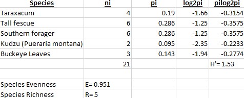
In the second backyard (Fig.2), the species diversity was calculated to be 1.08. The species evenness was 0.983 and species richness 3.
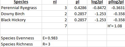
When comparing the two backyards to one another, we see that the H’ for backyard 1 is greater than backyard 2, which implies that the environment for backyard 1 is more diverse. However, the species evenness is greater in backyard 2 due to being closer to 1. In backyard one, Tall Fescue and Southern Forager dominated most of the are, and this is most likely due to the two plants having an advantage in that particular environment, whether that’s moisture level or sun exposure. In backyard 2, there was no real dominance of one species over another, which is most likely due to a lack of competition from other species.
Characteristics of an ecosystem with a high Shannon-Wiener Index include places with a healthy balance of rain, warmth, sunlight, and soil nutrients. Duration and intensity of the warm seasons also effects the outcome of this measurement because some plants take months to bloom. The presence of invasive species can negatively effect the diversity due to the higher success in competition between the invading and native species, resulting in the reduced fitness of the native species. The higher diversity level of backyard 1 is due to a lack of maintenance and high moisture level in the area is resides in. Water collects heavily throughout that area and the vegetation is rarely disturbed or cut. Along with this, the spot gets plenty of sunlight even though it’s at the base of a tree. In backyard 2, the lower diversity level is most likely due to selective, regular maintenance of the area along with the dominance of trees shading most of the sunlight.
Results Analysis
After analyzing the two backyards, it was found that Backyard 1 had the greater biodiversity. This also means that this backyard will have the greater degree of ecological stability. The reason that there is a correlation between a high biodiversity and a high ecological stability has to do with the variation of the species. If there are few species in an environment and they are introduced to an outside stress, there is less of a chance that there could be a species that can adapt or survive that outside stress. If there is a greater diversity in species and number of individuals in that species, then there is a far greater chance that any one of those species can buffer the effects of that outside stress and survive.
Peer Review Article
Below is a research article in the widely renowned journal “Nature” that explains biodiversity as a whole and how it is under pressure in our ever-changing landscape and climate.
Anna Armstrong. (2017). Biodiversity. Nature, 546(7656), 47. https://doi.org/10.1038/546047a
Credit
Works Cited
Results
For the following data, two backyards had pictures taken of them and the species of vegetation within each picture was identified and counted to the best of our ability. The species diversity and evenness were then analyzed using this gathered information, evenness being how proportional the number of individuals of each species are in relation to the other species. The closer to 1 that the species evenness get to, the more even in population level each species is to each other. For the first backyard (Fig.1), the species diversity was calculated using the Shannon-Wiener Index (H’), resulting in a value of 1.53. The higher this value, the more diverse the environment. The species evenness (E=0.951) was then calculated using H’ and species richness (R=5).
In the second backyard (Fig.2), the species diversity was calculated to be 1.08. The species evenness was 0.983 and species richness 3.
When comparing the two backyards to one another, we see that the H’ for backyard 1 is greater than backyard 2, which implies that the environment for backyard 1 is more diverse. However, the species evenness is greater in backyard 2 due to being closer to 1. In backyard one, Tall Fescue and Southern Forager dominated most of the are, and this is most likely due to the two plants having an advantage in that particular environment, whether that’s moisture level or sun exposure. In backyard 2, there was no real dominance of one species over another, which is most likely due to a lack of competition from other species.
Characteristics of an ecosystem with a high Shannon-Wiener Index include places with a healthy balance of rain, warmth, sunlight, and soil nutrients. Duration and intensity of the warm seasons also effects the outcome of this measurement because some plants take months to bloom. The presence of invasive species can negatively effect the diversity due to the higher success in competition between the invading and native species, resulting in the reduced fitness of the native species. The higher diversity level of backyard 1 is due to a lack of maintenance and high moisture level in the area is resides in. Water collects heavily throughout that area and the vegetation is rarely disturbed or cut. Along with this, the spot gets plenty of sunlight even though it’s at the base of a tree. In backyard 2, the lower diversity level is most likely due to selective, regular maintenance of the area along with the dominance of trees shading most of the sunlight.
A blog post by Derik Verkest and Bo Nash
Background/Introduction
As stated in the title of this blog; the contents of the blog are both a visual and written summary of data analysis of the home range of house cats. A home range itself is considered the actual physical area covered in the course of the regular movements of the animal being tracked. This is essentially and area or range where the animal goes on a daily basis. This differs from a territory, which is more commonly known, as the territory is an area that an animal defends. This area tends to have resources or something essential that the animal wants. You might be wondering: Why does the house cat need to have a home range? This is because any animal has to go gather resources it needs to live. If resources are far away the home range will be larger than if resources were close by. The house cats gave data to this lab by wearing a collar that transmits a GPS signal. This specific scientific technique is called radiotelemetry. The reason that home ranges are important is because these house cats can cause problems the world of conservation, but this information also shows social organization, foraging behavior, and even habitat requirements of these animals. Below you will find a graph that accumulates 90 different cats’ data. 30 cats from USA, 30 from Australia, and 30 from New Zealand.

Data was collected using the Movebank website, GoogleEarth, and Earth Point. Movebank is a website that collects tracking data for various animals all over the world. First, we searched Felis catus to narrow down our search to the common house cat. Thirty cats were picked at random from the USA, New Zealand and Australia, and coordinate information was downloaded and opened in GoogleEarth. Once the tracking information was opened in GoogleEarth, a polygon was drawn around the area of the home range for each cat, copied, then pasted into Earth Point where the area of the home range, in hectares, was calculated.
Once the home range area for all 90 cats was collected, the mean home range area for each country was calculated and compared (Fig. 1). The mean home range areas for New Zealand and the USA are roughly the same (about 6-8 hectares), but Australia’s mean home range area is 12 hectares; double that of New Zealand. Finally, a one-way ANOVA was ran on all three home range means, resulting in a p-value of 0.14 (>0.05). This indicates that there is no significant difference between the three means.

Some of the common habitats seen in these home ranges include urban areas, suburban areas with moderate tree density, and rural areas with moderate tree coverage and open fields. An environmental trend seen is that larger home ranges were almost always in rural areas with big open fields, and smaller home ranges were almost always in urban/suburban environments. Another trend seen was that houses were a common destination nodes, and when there was a field nearby the cats were inclined to explore it. Cats may be more attracted to fields for the same reason other predators are; rodents are easy to spot and chase down in an open field.
Overall, cats tend to have a smaller home range in urban/suburban areas, and a larger home range in rural areas. There were some cats that didn’t follow this idea, but individual cat personality, as well as uncontrolled variables like competing with other cats, may have had an influence on this. Based on the home ranges gathered, cats have the potential to have a serious environmental impact, especially when dozens of cats are allowed to roam free in a single neighborhood. If a cat has the ability to look over a reasonably large home range when given the opportunity but is confined to smaller spaces, then the effects that cat has will be greatly amplified. In other words, the mortality rate of many animal species in the smaller home range area will greatly increase.
Future Plans
Now that the home range is found for these cats, we can start to implement this data into city planning. If there was a city planner that not only wanted to help conservation of native species, but also keep house cats safe, they should take into account some details. The first being that there should be a perimeter around 12 hectacres of any housing district where there would be minimal damage to native wildlife. This is because 12 is the maximum home range found in the data above. This area should still have trees and shrubs, but not those that can house native wildlife. Outside of this specified area There should also be perhaps structures that the cats can climb so that way they will be ok with not going into forested areas where natural wildlife would be housed.
Peer Reviewed Research Article
The following peer review article studies the impact that feral cats have on the surrounding environment. The study also finds the home ranges of many cats that have turned feral and their impact that they had on natural wildlife. This wildlife included small mammals and birds mainly. These cats were also found to be carriers of pathogens. Previous studies found that SARS and the avian flu were both carried by feral cats to humans. The study captured a total of nine feral cats and found that the minimum distance traveled was 32,000 meters squared and the maximum was 351,000 meters squared. Although these home ranges were far larger than those in our study, the impact that these cats had on the ecological systems around them was profound. Both studies found the cats to be roaming in large areas over long periods of time. This is to collect resources such as food. This is the problem because the food that they end up taking is native wildlife that we are trying to conserve.
Citation: Moon, O., Lee, H., Kim, I., Kang, T., Cho, H., & Kim, D. (2013). Analysis of the Summer Season Home Range of Domestic Feral Cats (Felis catus) – Focused on the Surroundings of Rural and Suburban Areas. Journal of Asia-Pacific Biodiversity, 6(3), 391–396. https://doi.org/10.7229/jkn.2013.6.3.391
Works Cited
Credit
Derik Verkest: Results, Bar Graphs, Conclusion
Bo Nash: Background/Introduction, Future Plants, Peer Reviewed Article
Data was collected using the Movebank website, GoogleEarth, and Earth Point. Movebank is a website that collects tracking data for various animals all over the world. First, we searched Felis catus to narrow down our search to the common house cat. Thirty cats were picked at random from the USA, New Zealand and Australia, and coordinate information was downloaded and opened in GoogleEarth. Once the tracking information was opened in GoogleEarth, a polygon was drawn around the area of the home range for each cat, copied, then pasted into Earth Point where the area of the home range, in hectares, was calculated.
Once the home range area for all 90 cats was collected, the mean home range area for each country was calculated and compared (Fig. 1). The mean home range areas for New Zealand and the USA are roughly the same (about 6-8 hectares), but Australia’s mean home range area is 12 hectares; double that of New Zealand. Finally, a one-way ANOVA was ran on all three home range means, resulting in a p-value of 0.14 (>0.05). This indicates that there is no significant difference between the three means.
Some of the common habitats seen in these home ranges include urban areas, suburban areas with moderate tree density, and rural areas with moderate tree coverage and open fields. An environmental trend seen is that larger home ranges were almost always in rural areas with big open fields, and smaller home ranges were almost always in urban/suburban environments. Another trend seen was that houses were a common destination nodes, and when there was a field nearby the cats were inclined to explore it. Cats may be more attracted to fields for the same reason other predators are; rodents are easy to spot and chase down in an open field.
Overall, cats tend to have a smaller home range in urban/suburban areas, and a larger home range in rural areas. There were some cats that didn’t follow this idea, but individual cat personality, as well as uncontrolled variables like competing with other cats, may have had an influence on this. Based on the home ranges gathered, cats have the potential to have a serious environmental impact, especially when dozens of cats are allowed to roam free in a single neighborhood. If a cat has the ability to look over a reasonably large home range when given the opportunity but is confined to smaller spaces, then the effects that cat has will be greatly amplified. In other words, the mortality rate of many animal species in the smaller home range area will greatly increase.
A blog post by Derik Verkest and Bo Nash
Background
The urban environment is becoming increasingly a part of human life. It is estimated that around half of the the population lives in a city environment or a surrounding urban area. These environments themselves are an ecosystem on their own. An ecosystem dominated by a high-density of buildings, paved surfaces, and even its own climate. This climate being dominated by the Urban Heat Island. This occurs when the temperature is higher over cities than the surrounding areas. Although you would think this environment would be intriguing to study for ecologists, very little is known about urban environments and the organisms that occupy them. This understanding will become increasingly important in the coming years as it is estimated that two-thirds of the world population will be moving into this unique environment. That is what we hope to do in this lab; provide an understanding of how organisms react to being in an urban environment.

Introduction
This lab is going to show how human eating habits can also affect the eating habits of organisms in an urban environment. This happens because humans generate a large amount of food waste and organisms in urban environments will eat this food as it is the easiest accessible. This lab will show data indicating whether the temperature of the surface and the permeability of the surface (if water can go through it) in an urban environment will affect ant food preferences. Below you will find graphs and statistical analyses that display this information visually so you can see if an urban environment effects ant food preferences.
The procedure for sampling every year involved groups of four. Each group selected four total locations around campus, two locations that were green and two locations that were paved. Each group had a sampling kit containing a box of ziplock bags, five mason jars containing liquid food baits (water, sugar, oil, salt, and amino acid), index cards, flags, thermometer, plastic spoons, and four ant experiment signs. At each location, five cotton balls, each soaked in a unique liquid food, was placed on a labeled index card and left to sit for an hour. Group name, date, food bait, name of sampling location, and whether or not the location was green or paved was written on every index card.
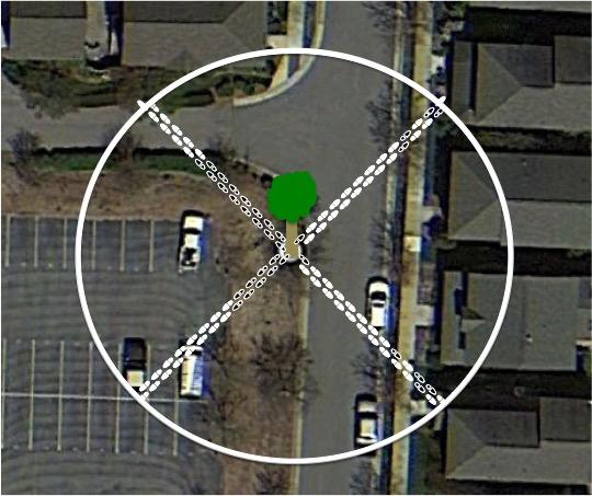
The thermometer was used to record the temperature (°C) of each sampling location, and the percent of impervious surface of the area was calculated using the Pace-to-Plant method. This method was executed by starting at the sampling location, and taking 25 steps at all four 45° angles (Fig.1). Out of all 100 steps taken, we divided the amount of steps that we took on pavement by the total of 100 steps taken to get the percent of impervious surface. After an hour, each index card, containing the food bait and ants, was put into an individual ziplock and brought back to the lab for counting.
With the data acquired, we compared and analyzed the relationship between the independent variables (impervious surface percentage, temperature, food bait) and the dependent variable (number of ants) for years 2016-2018.
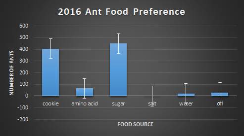
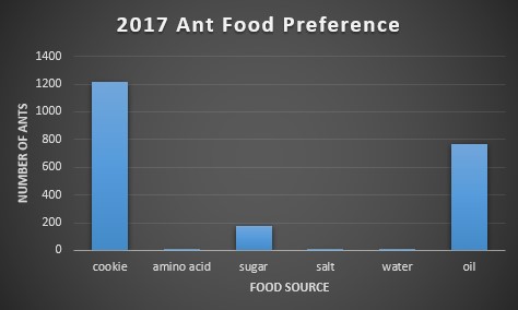
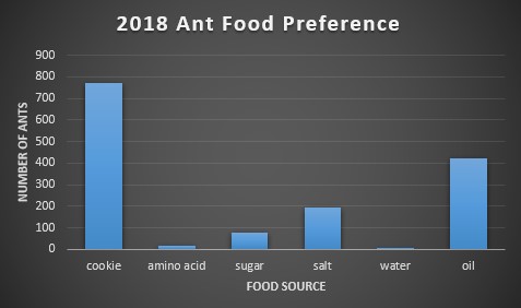
First, each food bait was compared to the amount of ants found on them. Below, figures 2-4 show this relationship. In 2016, the choice of food was overwhelmingly cookie and sugar, and for 2017 and 2018, cookie and oil were the preferred choice of food. The massive difference in ant abundance and food bait choice in 2016 is due to a drought. The lack of water would inevitability drop population numbers and emergence patterns in the ants.
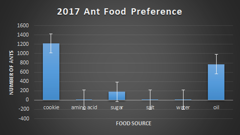

Second, we ran a one-way ANOVA on food preference for each year in order to find if there was a significant preference for certain baits over others. For 2016 the p-value was 0.058, for 2017 it was 0.13, and for 2018 it was 0.051. Due to all p-values being greater than 0.05, we cannot conclude that there’s a significant difference in food preference among baits. On an ecological level, this could imply that ants are very versatile in their consumption needs, making them more adaptable to environmental change.
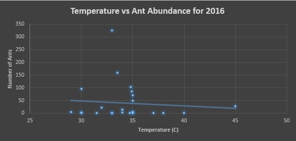
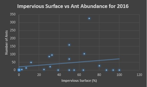
Finally, for each year we made two scatter plots, one assessing the affects of temperature on ant abundance and the other assessing the affects of impervious surface percentage on ant abundance. In figures 5 and 6, we see these assessments for 2016. Figure 5 shows a majority of ants being counted in temperatures ranging from 30-35°C, and figure 6 we see that areas ranging in 50-70% impervious surface area had the most ants counted.


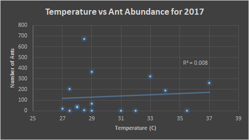
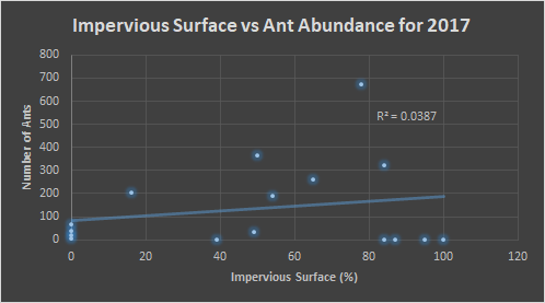
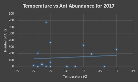
Below, in figures 7 and 8, we see the same comparisons for 2017. For the temperature, the trend indicates that the preference is similar to that of 2016, 30-35°C. However, the trend is weak. Figure 8 indicates an ant preference for impervious surface to be around 50-80% of the surrounding area.
The ant abundance was also at its peak between 30-35°C for the year 2018. In order to better understand the data, a point outside the range of this graph was excluded from view, however the data point is still influencing the trend line. It was for a location where 780 ants were counted in 32°C. The same data point was removed from figure 10, where 780 ants were counted at 77% impervious surface. Here the area with 50-80% impervious surface was where a majority of ants were counted.
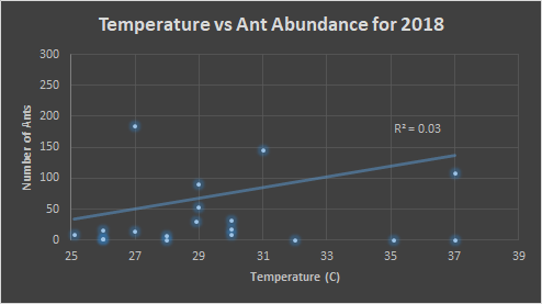
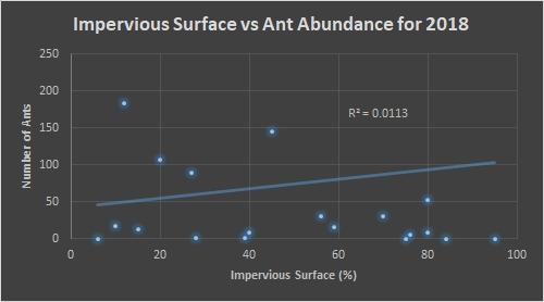
We see over the three years that the impervious surface percentage that produces larger ant numbers stays relatively similar, around 50-70%. This is ecologically significant because we normally think of environmental fragmentation as being a negative on animals. We might assume from this that lack of competition from other ants, due to the impervious barriers, could allow colonies to maintain a balance between population abundance and resource competition. Temperature was another factor that seemed to be important in the amount of ant activity, as all three years showed a prefer-ability for 30-35°C.
Bugs in Manhattan
A similarity between this study conducted in Manhattan and the one we performed is the impact of ants on the urban environment. In their study covering 150 blocks of street medians, ants devoured thousands of pounds of trash over the course of a year (Bakalar, 2014), which fits with the quick response time of all the ants in our study. Within just an hour, there were hundreds of ants lining up for the food we laid out.
The prosperity of these insect populations could mean that the urban space is an ideal environment for insects. With green spaces fragmented, insects compete less with one another while receiving an increase in dropped food scraps. The fragmentation can also act as an environmental barrier, like mountains do to small mammals, posing the potential to cause speciation among a parent insect species. Other organisms that may benefit from the urban environment are birds. One study looked at which birds would survive better being spontaneously place on an oceanic island, urban birds or rural birds (Møller, et al. 2015). It found that the urban birds were much more successful at establishing themselves than the rural birds were. This implies that birds born and raised in urban areas are being effected cognitively by the environment.
Humans can help improve the function of cities as ecosystems by simply being more aware and mindful of their actions. Choosing to throw your food on the grass rather than feeling morally obligated to pick up after yourself is a great start. Cities can also have regulations in place that require construction companies and developers to allocate at least 30% of the property to green space. This would ensure that urban development couldn’t over-fragment the environment to the point of mass insect extinctions.
Frontiers in Ecology: Urban Ecology
Peer Review Citation
Works Cited
Credit
The procedure for sampling every year involved groups of four. Each group selected four total locations around campus, two locations that were green and two locations that were paved. Each group had a sampling kit containing a box of ziplock bags, five mason jars containing liquid food baits (water, sugar, oil, salt, and amino acid), index cards, flags, thermometer, plastic spoons, and four ant experiment signs. At each location, five cotton balls, each soaked in a unique liquid food, was placed on a labeled index card and left to sit for an hour. Group name, date, food bait, name of sampling location, and whether or not the location was green or paved was written on every index card.
The thermometer was used to record the temperature (°C) of each sampling location, and the percent of impervious surface of the area was calculated using the Pace-to-Plant method. This method was executed by starting at the sampling location, and taking 25 steps at all four 45° angles (Fig.1). Out of all 100 steps taken, we divided the amount of steps that we took on pavement by the total of 100 steps taken to get the percent of impervious surface. After an hour, each index card, containing the food bait and ants, was put into an individual ziplock and brought back to the lab for counting.
With the data acquired, we compared and analyzed the relationship between the independent variables (impervious surface percentage, temperature, food bait) and the dependent variable (number of ants) for years 2016-2018.
First, each food bait was compared to the amount of ants found on them. Below, figures 2-4 show this relationship. In 2016, the choice of food was overwhelmingly cookie and sugar, and for 2017 and 2018, cookie and oil were the preferred choice of food. The massive difference in ant abundance and food bait choice in 2016 is due to a drought. The lack of water would inevitability drop population numbers and emergence patterns in the ants.

Second, we ran a one-way ANOVA on food preference for each year in order to find if there was a significant preference for certain baits over others. For 2016 the p-value was 0.058, for 2017 it was 0.13, and for 2018 it was 0.051. Due to all p-values being greater than 0.05, we cannot conclude that there’s a significant difference in food preference among baits. On an ecological level, this could imply that ants are very versatile in their consumption needs, making them more adaptable to environmental change.
Finally, for each year we made two scatter plots, one assessing the affects of temperature on ant abundance and the other assessing the affects of impervious surface percentage on ant abundance. In figures 5 and 6, we see these assessments for 2016. Figure 5 shows a majority of ants being counted in temperatures ranging from 30-35°C, and figure 6 we see that areas ranging in 50-70% impervious surface area had the most ants counted.
Below, in figures 7 and 8, we see the same comparisons for 2017. For the temperature, the trend indicates that the preference is similar to that of 2016, 30-35°C. However, the trend is weak. Figure 8 indicates an ant preference for impervious surface to be around 50-80% of the surrounding area.

The ant abundance was also at its peak between 30-35°C for the year 2018. In order to better understand the data, a point outside the range of this graph was excluded from view, however the data point is still influencing the trend line. It was for a location where 780 ants were counted in 32°C. The same data point was removed from figure 10, where 780 ants were counted at 77% impervious surface. Here the area with 50-80% impervious surface was where a majority of ants were counted.


We see over the three years that the impervious surface percentage that produces larger ant numbers stays relatively similar, around 50-70%. This is ecologically significant because we normally think of environmental fragmentation as being a negative on animals. We might assume from this that lack of competition from other ants, due to the impervious barriers, could allow colonies to maintain a balance between population abundance and resource competition. Temperature was another factor that seemed to be important in the amount of ant activity, as all three years showed a prefer-ability for 30-35°C.
Bugs in Manhattan
A similarity between this study conducted in Manhattan and the one we performed is the impact of ants on the urban environment. In their study covering 150 blocks of street medians, ants devoured thousands of pounds of trash over the course of a year (Bakalar, 2014), which fits with the quick response time of all the ants in our study. Within just an hour, there were hundreds of ants lining up for the food we laid out.
The prosperity of these insect populations could mean that the urban space is an ideal environment for insects. With green spaces fragmented, insects compete less with one another while receiving an increase in dropped food scraps. The fragmentation can also act as an environmental barrier, like mountains do to small mammals, posing the potential to cause speciation among a parent insect species. Other organisms that may benefit from the urban environment are birds. One study looked at which birds would survive better being spontaneously place on an oceanic island, urban birds or rural birds (Møller, et al. 2015). It found that the urban birds were much more successful at establishing themselves than the rural birds were. This implies that birds born and raised in urban areas are being effected cognitively by the environment.
Humans can help improve the function of cities as ecosystems by simply being more aware and mindful of their actions. Choosing to throw your food on the grass rather than feeling morally obligated to pick up after yourself is a great start. Cities can also have regulations in place that require construction companies and developers to allocate at least 30% of the property to green space. This would ensure that urban development couldn’t over-fragment the environment to the point of mass insect extinctions.
–Bakalar, N. (2014, Dec 2). Bugs in Manhattan Compete With Rats for Food Refuse. Retrieved from https://www.nytimes.com/2014/12/02/science/bugs-in-manhattan-compete-with-rats-for-food-refuse.html
–Møller, A., Díaz, M., Flensted-Jensen, E., Grim, T., Ibáñez-Álamo, J., Jokimäki, J., … Tryjanowski, P. (2015). Urbanized birds have superior establishment success in novel environments. Oecologia, 178(3), 943–950. https://doi.org/10.1007/s00442-015-3268-8
A blog post by Derik Verkest and Bo Nash
Introduction
Adaptations and variation of individuals in species is an important part in their evolutionary growth. These adaptations help them function at their optimal level throughout their life. In this experiment we analyzed the adaptation of a single species of oak leaves. You may be asking: How can their be differences within a single species? The answer to this is a concept called within-individual variation. Even if two individuals have the same phenotype (physical characteristics) and are in the same environment chance processes unique to the individual will create differences in survivability and reproduction. This essentially means that adaptations occur in the same species because individuals might be living in a different niche than their counterparts. Although we will not be analyzing this concept as much as within-individual variation, between-individual variations provides key insights that could help the experiment be analyzed better. This variation is when individuals with different phenotypes will experience differences in survivability and reproduction. This is considered the variation within populations instead of within individuals.

Experimental Background
In this experiment we accessed within individual variation of oak leaves. Variation in leaves are important because of two main functions of leaves themselves: (1) the leaf must capture sunlight for photosynthesis, and (2) the leaf must take in CO2 through pores called stomata without losing too much water. The reason that there is variation within oak leaves on the same tree is that the leaves are different based on where they are located on the tree. If they are on the multi-layer canopy they might adapt for gathering more sunglight without drying out. If they are on the mono-layer inside then they would try to gain as much sunlight as possible. We predicted that the leaves from the outside would have a smaller surface area than leaves on the inside so they could optimize light intake without overheating and drying out. We believe this is the case because the smaller leaves could still undergo optimal photosynthesis because they receive more direct sunlight due to them being on the canopy. But at the same time they would have a smaller surface area so they wouldn’t overheat or dry out through CO2 intake.
Experiment and Results
Leaves of an oak tree vary in size, being broader to optimize sun exposure and being more narrow to minimize heat stress. The objective of this experiment was to test the hypothesis that if the sunlight exposure of leaves vary among the leaves of an oak tree, then the leaves that are on the outer part of the tree would be more narrow than the leaves on the inner part of the tree. To test this hypothesis, data was collected on the sizes of four groups of ten inner leaves and ten outer leaves. Each group had a pile of ten outer leaves of an oak tree and ten inner leaves, and measured the area of each leaf in squared centimeters. In order to do this, each leaf was placed on square-centimeter-grid paper and traced. Once traced, any squares that were more than 50% covered by leaf were counted towards the total area of that leaf.
After all four groups of leaves were measured, the data was collected to analyze the within-individual variation and the between-individual variation of each group of leaves. The within-individual variation (Fig.1) was assessed using the data from group 1 (BNDV). In this group the average area of an inner leaf was 38.6 square-centimeters with a standard error of 2.87, and the average area of an outer leaf was 30.4 square-centimeters with a standard error of 1.97.

The between-individual variation (Fig.2) was then assessed using the data from all four groups. Group 1 was BNDV, group 2 was NM, group 3 was NAJW, and group 4 was TABS. The first thing you notice right away is the larger standard error of the outer leaves than the inner leaves, which is an example of within-individual variation. This could be due to the varying amount of light the outer leaves are exposed to (side of tree compared to the top), while the inner leaves all have roughly equal the amount of light loss no matter where they may be located inside the tree. Another thing to notice is that the inner leaves of the trees don’t vary too much in size from tree to tree, however the outer leaves do. On a larger scale, this between-individual variation among the four groups could show the reproductive success of a phenotypic expression for outer leaf size in their environment.
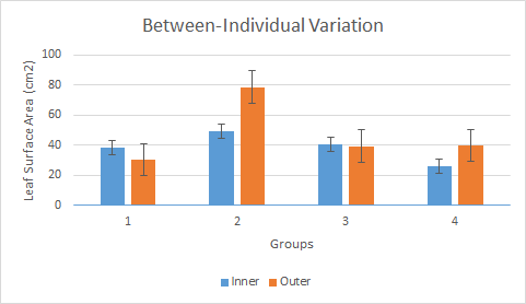
The results of group 1 were much different when compared to the others as well, having a mean average for the outer leaves being lower than the inner leaves. This was either due to an error of the individual in counting or is just part of the overall wide variation of outer leaf size among all the groups. It’s hard to say without a larger sample population.
A student t-test (Fig.3) was also conducted on the data for all groups. The average size of the outer leaves was 47 square-centimeters, and 38.575 square-centimeters for the inner leaves. Due to our p-values being less than our alpha value of 0.05, we have to reject our hypothesis that outer leaves are always inherently smaller than the inner leaves of oak trees. This makes sense, as the outer leaf sizes varied widely among all four of the groups, making it unclear as to whether or not there is a statistical significance.

Overall, it was found that the leaves of the inner layer had a higher surface area than those of the outer layer. This is understandable because on the inner layer the leave have limited sunlight, so they will have a larger surface area in order to gather what little sunlight it is getting. Ecologists and farmers alike would need to understand this because if they were planning on planting a certain crop or studying a specific crop plant, then this pattern of surface area distribution could be consistent with other plants. This would be the significance of the concepts of variation within a species. This is important because it shows how individual parts of a whole organism can be different withing a species depending on what environmental niche those individuals hold.
External Article Analysis
In order to provide a more real world scenario that shows the importance of variation, this article shows how variation within a species can even impact global change. This change being climate change and the variation within a species being that of wildflowers. The questions below will help analyze this article and provide clarification on how this can happen.
Peer Reviewed Article: Scheffers, B., De Meester, L., Bridge, T., Hoffmann, A., Pandolfi, J., Corlett, R., … Watson, J. (2016). The broad footprint of climate change from genes to biomes to people. Science, 354(6313), n/a. https://doi.org/10.1126/science.aaf7671
Credit
Bo Nash: Introduction, Oak Leaf picture, Experiment, External Article Analysis
Derik Verkest: Questions 1-4 from Canvas, Experiment and Results, all graphs, conclusion
A blog post by Derik Verkest and Bo Nash
Background
Evolution is the mechanism through which the organisms that are around today came to be. Evolution occurs when an organisms genes and alleles are changed over a period of time. In short, genes are an organism’s characteristics, while alleles are their traits. This evolution and change in alleles occurs in many ways, but today we will be discussing evolution through a process called natural selection. Natural selection is when an organism is chosen naturally based off of if they can survive in the ecosystem that inhabit. In order for natural selection to occur, certain conditions must be met: 1) there are more offspring being produced than the environment can support, 2) there is variation among individuals, 3) this variation is inherited, 4) some individuals will survive and reproduce at higher rates than others. Knowing when populations are undergoing evolution is an important aspect that scientists study. In order to determine whether a population undergoes evolution, scientists use a mathematical model called the Hardy-Weinberg Equilibrium. This mathematical equation is represented as: p^2+2pq+q^2=1. This might seem complicated, but it actually the opposite. All of the “p” values represent the dominant allele while all of the “q” values represent the recessive allele. A dominant allele is usually represented by a capital letter and the trait that this allele represents is the one that is physically shown by the organism. A recessive allele is the opposite. It is represented by a lower case letter and it’s trait is only shown when there are two recessive alleles, or homozygous. Along with evolution and the Hardy-Weinberg equilibrium, this experiment will show the relative fitness of our populations. This is not the fitness that you think of. It’s not bench pressing or squatting or muscle size. Relative fitness is an organism’s reproductive success, or how successful an organism is at passing down its genetics to the next generations.

Experiment
A classic example of evolution and natural selection are the moths during the industrial revolution. Scientists found that moths with darker colors were more likely to survive in highly polluted areas while moths with a lighter color would not survive in polluted areas, but would survive more often in nonpolluted areas. The dark color is called melanistic while the light color was called mottled. For your ease of understanding these are the following genotypes and corresponding phenotypes. The melanistic moths are represented by MM and Mm. The mottled moths will be represented by mm. Three different “environments” were used to determine allele frequency and fitness. A dark environment with few light spots, a mixed, and a light environment with few dark spots. Over the course of 4 generations, we spread out representatives of the different colored moths and determined their allele frequencies. For example, we put dark and light moths in the dark environment. When we mixed the population the dark moths that were on the dark surfaces would stay but the light moths on the dark surface would be taken out. This is how each experiment in each environment went and this determined the next generation’s population composition. For the remainder of this blog posts you will see graphical representations of what we found and why it is important.
Results
The relative fitness of the dark-colored Peppered Moths in the experiment, whether that be the homozygous dominant (MM) or heterozygous (Mm) genotypes, experienced an increase or no change with the increase in pollution over time, however the relative fitness of the light-colored homozygous recessive (mm) genotype experienced a decrease in relative fitness over time. Going from low pollution to high pollution (low-moderate-high), the relative fitness of the homozygous dominant genotype was 1-1-1, the heterozygous genotype was 0.33-0.4-1, and the homozygous recessive genotype was 1-0.5-0. This shows a clear correlation between the change in environment and its selection against the light-colored Peppered Moths. Therefore, the darker-colored Peppered Moths have a greater ability to survive in an environment with increased pollution due to the increased predation of light-colored Peppered Moths. The bar graph below (Fig.1) shows this change in relative fitness by tracking the genotype frequency over time as the pollution increased.
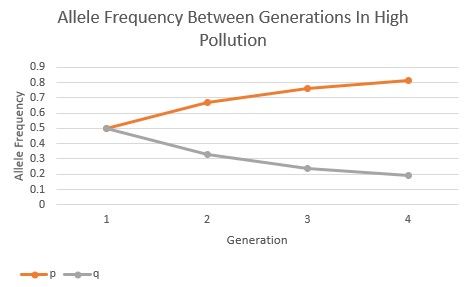
The allele frequency of the Peppered Moths were also calculated and graphed between generations as the pollution levels transitioned from low to high. In the graph below (Fig.2), the allele frequency of the dominant (p) and recessive (q) alleles are relatively balanced in their expression within the low pollution environment over all four generations.

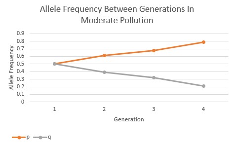
However, as the pollution increased in the environment the allele frequencies began to change in response. In the moderate pollution environment (Fig.3), the recessive allele is passed on to the subsequent generations in lesser and lesser frequency, and the dominant allele increases in frequency over the subsequent generations. The pollution is showing to have a directional selection in favor of the darker-colored, phenotypic expression of the Peppered Moths.
In the high pollution environment, the selection of the dominant allele over the recessive allele occurs at an even faster rate when compared to the moderate pollution environment, as seen below (Fig.4). Between all three of these allele frequency graphs, it’s evident that the rate and intensity of directional selection increases as the pollution increases, showing a clear correlation between the two variables.
Bar Graphs
Below are three bar graphs that show the allele and genotypic frequencies of the types of moths over a course of four generations. These graphs also show this data across all three environmental representations of low pollution, moderate pollution, and high pollution.


Instead of analyzing all of these individually we will look at the results of the experiment as a whole. The idea of melanistic moths surviving in more polluted environments hold true. This is shown in both the high and moderate pollution graphs, which show that the homozygous dominant (MM) and heterozygous (Mm) genotypes for the melanistic moths were at the highest frequencies. This also shows that the lighter molted moths (mm) did not survive in these environments throughout the generations, but had their highest frequencies in the low pollution environments, which was expected.
External Article
The article that was assigned along with this experiment was “Man’s new best friend? A forgotten Russian experiment in fox domestication”. This article showed Russian Scientists in the early and mid-19th century attempted to domesticate wild foxes based off of how tame they were when they interacted with humans. Belyaev selected for this tameness by having the foxes interact with humans while being fed. If the fox would hiss and go away they were not allowed to breed, but if they were OK with human contact and even welcomed it they were selectively bred. It was expected that there would be some change in domesticated fox behavior as more generations were formed, but not that much. These foxes formed droopy ears, smaller tails, welcomed and sought out human contact, and even lost some of their “musky fox” scent. This shows that artificial selection for a trait does work.
Credit
Bo Nash: Introduction, Experiment, Bar Graphs, Discussion
Derik Verkest: Results, Line Graphs, External Article
Peer Reviewed Article
Although not about moths, this peer reviewed article on evolution and adaptation of seeds of Japanese Orchids can help clarify ideas of evolution and also provides another example of how the environment can influence an organism over time.
Works Cited:
Results
The relative fitness of the dark-colored Peppered Moths in the experiment, whether that be the homozygous dominant (MM) or heterozygous (Mm) genotypes, experienced an increase or no change with the increase in pollution over time, however the relative fitness of the light-colored homozygous recessive (mm) genotype experienced a decrease in relative fitness over time. Going from low pollution to high pollution (low-moderate-high), the relative fitness of the homozygous dominant genotype was 1-1-1, the heterozygous genotype was 0.33-0.4-1, and the homozygous recessive genotype was 1-0.5-0. This shows a clear correlation between the change in environment and its selection against the light-colored Peppered Moths. Therefore, the darker-colored Peppered Moths have a greater ability to survive in an environment with increased pollution due to the increased predation of light-colored Peppered Moths. The bar graph below (Fig.1) shows this change in relative fitness by tracking the genotype frequency over time as the pollution increased.
The allele frequency of the Peppered Moths were also calculated and graphed between generations as the pollution levels transitioned from low to high. In the graph below (Fig.2), the allele frequency of the dominant (p) and recessive (q) alleles are relatively balanced in their expression within the low pollution environment over all four generations.
However, as the pollution increased in the environment the allele frequencies began to change in response. In the moderate pollution environment (Fig.3), the recessive allele is passed on to the subsequent generations in lesser and lesser frequency, and the dominant allele increases in frequency over the subsequent generations. The pollution is showing to have a directional selection in favor of the darker-colored, phenotypic expression of the Peppered Moths.
In the high pollution environment, the selection of the dominant allele over the recessive allele occurs at an even faster rate when compared to the moderate pollution environment, as seen below (Fig.4). Between all three of these allele frequency graphs, it’s evident that the rate and intensity of directional selection increases as the pollution increases, showing a clear correlation between the two variables.
A blog post by Derik Verkest and Bo Nash
Introduction for Part 1
The regulation of internal body temperature is important to the survival of organisms. Every animal does this differently, but the common goal at the end of it all is to have the internal temperature required to catalyze reactions and biochemical processes inside the body. There are two main types of internal temperature regulation strategies performed by animals, ectothermy and endothermy. Ectothermic animals keep their internal temperature stable using the external environment, and Endothermic animals use the heat produced from their metabolism to keep their internal temperatures stable. Along with these two main strategies, animals also use a mix of other physiological, anatomical, and behavioral adaptations to help make these processes as efficient as possible. These include surface area to volume ratios, the use of fat or fur to assist in insulation, hibernation, and basking practices. For example, in order to avoid lethal internal body temperatures endotherms need to be able to dissipate that heat quickly (Nilsson et al. 2016). One strategy that can be used for this problem is by having a high surface area to volume ratio. In our case as humans, we use this method along with our superior ability to cool off through perspiration. The goal of the experiment in part 1 will be to observe the effects of external temperature on the heating and cooling of an organisms internals.
Experimental Method for Part 1
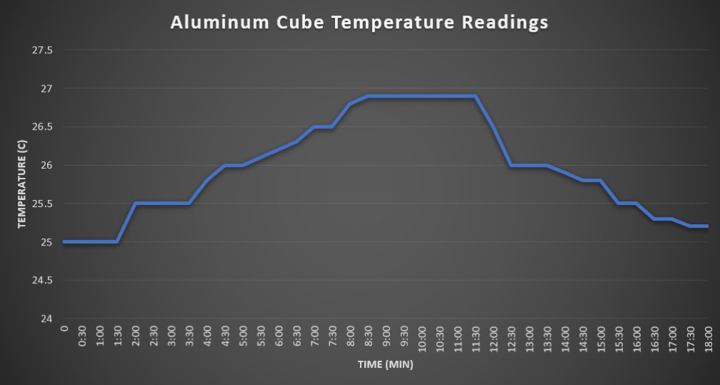
In our first experiment, we took kitchen-grade aluminum foil and made a roughly ten-cubic-centimeter cube shape out of it to represent the body of an animal, most likely an ectotherm in this case. We then took the initial temperature of the inside of the cube, using a basic glass thermometer, prior to its heating. Once we recorded this initial temperature, we placed the aluminum cube about fifteen centimeters under a heat lamp to replicate sun exposure. While under the heat lamp, we took temperature readings of the inside of the cube every thirty seconds. We continued to record until a temperature plateau was reached, turned off the heat lamp, then recorded the temperature until it roughly reached the initial temperature prior to placing the cube under the heat lamp.
Results for Part 1
The initial internal temperature reading of the aluminum cube was 25°C. It took approximately 18 minutes total for the cubes interior to reach maximum temperature and return to baseline. For the first nine minutes, the interior heated at rate of roughly 0.5°C per 2-3 minutes. Peak temperature of 26.9°C was reached and sustained from 9 minutes to 11:30 minutes. At the 11 minutes mark, we turned the light off and recorded the cooling period. The rate of cooling was roughly 1°C per 2-3 minutes until it reached baseline around the 18 minute mark.
Conclusion of Part 1
We observed that the heat emitted by the heat lamp was able to slowly heat the interior of the aluminum foil cube to a constant temperature of 26.9°C. This aluminum cube in the experiment is most analogous with ectotherms, as it lacked a large size, insulation, or an internal source of heat. Variables that may have affected the accuracy of the data collected include sunlight exposure from nearby windows, the aluminum material having a specific heat capacity that influenced how the heat was absorbed, other openings in the cube allowing heat exchange with the external environment, and the position of the cube to the heat lamp used in the experiment.
Individual Experiment
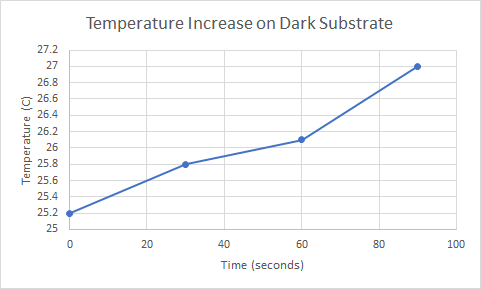
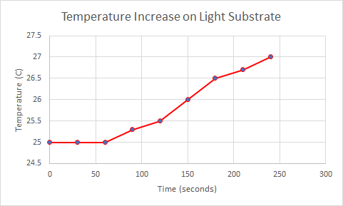
After analyzing the graphs and the trends that our ‘animal’ did in Part I we decided to conduct an experiment of our own. This experiment involved two aluminum animals with cotton balls in their interior in order to represent endotherms. The variables that we were comparing were the colors of the substrates. This being if the ground beneath the animal’s feet is dark or light. This was of interest to us based off of what we knew about heat island effect and the difference between heat on a dark surface, such as a tar road, or a light surface, such as sand. The information that we were looking for was to see which surface caused the endotherms to heat up the fastest. The thermometers and the interior of the endotherms was a constant 25 Celsius without any outside heating added. We then put each animal on either a black or white surface and placed them under a heat lamp. In order to provide consistent information we measured how long it would take for the animals to get warmer by 2 degrees Celsius to 27 degrees.
Hypothesis: The endotherm on the dark substrate will increase in temperature faster than one on a light substrate.
The data below is from the first round of experiments that were conducted to see the relationship between color of substrate and time it took for the temperature to increase. It shows that it takes 90 seconds for the endotherm on the dark substrate to increase temperature to 27C while it takes 240 seconds for the endotherm on the light substrate to increase to 27C.
The data below this column will show the increase of temperature for the second round of this experiment. The results almost directly correlate to the data from the first round of the experiment. Below you will see data that shows the endotherm on the dark substrate reaching 27C in 60 seconds while it takes the endotherm on the light substrate 150 seconds to reach the same temperature.


Now that there is usable data from these two rounds of experiments, we can now run a statistical analysis to determine if the two sections were that different. Since we are only comparing two variables (dark vs. light substrate), the statistical analysis that will be used is called the T-test. If the ‘p’ from this test is less than 0.05, the the groups are determine to be significantly different. If ‘p’ is greater than 0.05 then we can’t tell the groups apart.
The data below represents the T-test for trial 1:

The data below represents the T-test for trial 2:
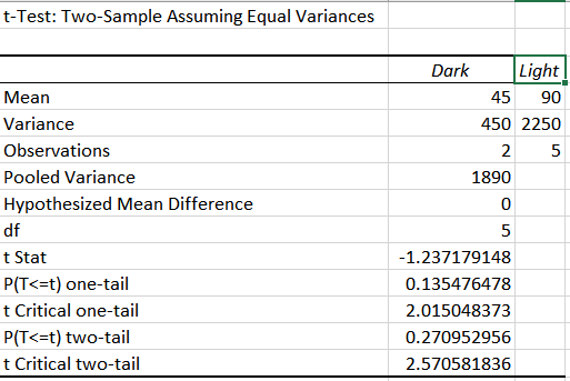
After analyzing this information, it can be seen that it takes a significantly longer time for the temperature to increase on a light substrate rather than a dark one. Eyeballing the numbers will tell you this but if you rely on the T-test it will tell you that the two groups are difficult to tell apart, as both of their values exceed 0.05.
Part II: Dinosaur Thermal Regulation
After reading this study, we found that there were similarities found that matched some of our own observations. From the heating and cooling curve information presented at the beginning of this blog post, it can be seen that ectotherms both increase and decrease in response to environmental temperature significantly faster than the endotherms in our individual experiment. The article put it best that “endothermy as mass-independent energy expenditure”. This meaning that the metabolism remains consistent regardless of size, whereas ectotherms are highly dependent on size and environmental conditions. This is the reason that dinosaurs began to decrease in size and eventually evolve into birds, because being and endotherm is highly advantageous to hunters and animals that want to migrate into different environments.
Communicating these results across a gradient of ages is an important part of being a scientist. These results might seem complicated even to someone who has been educated. But science communication doesn’t discriminate it’s readers based on age or education level. In order to show this we will communicate the information found in the dinosaur article to a middle school student and a retiree. To the middle school student we would have to make sure that endotherm and ectotherm were described as “the animal is OK with all temperatures” and “the animal needs warm temperatures to live comfortably” respectively. Since middle schoolers have an active imagination we will then tell them about how dinosaurs became what we see as today as birds and how being and endotherm is beneficial. And to the retiree we will be able to use more complicated terms, seeing as they have been exposed to scientific information either directly or indirectly throughout their life.
Credits:
Bo Nash: Individual Experiment & Part II
Derik Verkest: Introduction, Part I, Peer Review Citation
References
-Jeewandara, Thamarasee. “Shrinking Dinosaurs and the Evolution of Endothermy in Birds.” Phys.org, Phys.org, 15 Jan. 2020, phys.org/news/2020-01-dinosaurs-evolution-endothermy-birds.html.
-Nilsson, J., Molokwu, M. N., & Olsson, O. (2016). Body temperature regulation in hot environments. PLoS One, 11(8) doi:http://dx.doi.org.proxy.lib.utc.edu/10.1371/journal.pone.0161481
