Introduction for Part 1 The regulation of internal body temperature is important to the survival of organisms. Every animal does this differently, but the common goal at the end of it all is to have the internal temperature required to catalyze reactions and biochemical processes inside the body. There are two main types of internal temperature regulation strategies performed by animals, ectothermy and endothermy. Ectothermic animals keep their internal temperature stable using the external environment, and Endothermic animals use the heat produced from their metabolism to keep their internal temperatures stable. Along with these two main strategies, animals also use a mix of other physiological, anatomical, and behavioral adaptations to help make these processes as efficient as possible. These include surface area to volume ratios, the use of fat or fur to assist in insulation, hibernation, and basking practices. For example, in order to avoid lethal internal body temperatures endotherms need to be able to dissipate that heat quickly (Nilsson et al. 2016). One strategy that can be used for this problem is by having a high surface area to volume ratio. In our case as humans, we use this method along with our superior ability to cool off through perspiration. The goal of the experiment in part 1 will be to observe the effects of external temperature on the heating and cooling of an organisms internals.
Experimental Method for Part 1 In our first experiment, we took kitchen-grade aluminum foil and made a roughly ten-cubic-centimeter cube shape out of it to represent the body of an animal, most likely an ectotherm in this case. We then took the initial temperature of the inside of the cube, using a basic glass thermometer, prior to its heating. Once we recorded this initial temperature, we placed the aluminum cube about fifteen centimeters under a heat lamp to replicate sun exposure. While under the heat lamp, we took temperature readings of the inside of the cube every thirty seconds. We continued to record until a temperature plateau was reached, turned off the heat lamp, then recorded the temperature until it roughly reached the initial temperature prior to placing the cube under the heat lamp.
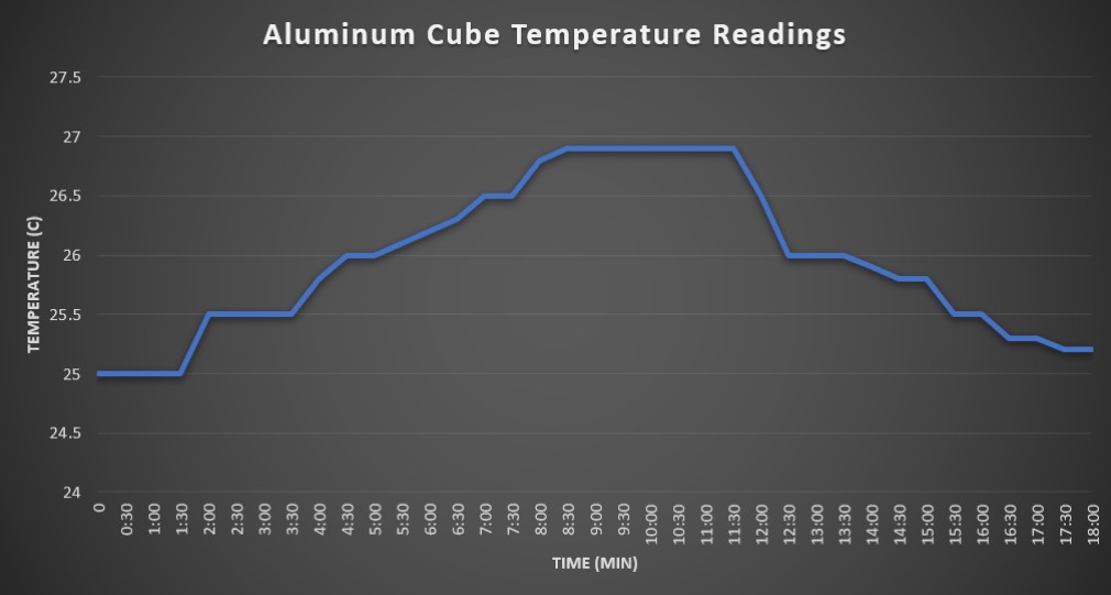
Results for Part 1 The initial internal temperature reading of the aluminum cube was 25°C. It took approximately 18 minutes total for the cubes interior to reach maximum temperature and return to baseline. For the first nine minutes, the interior heated at rate of roughly 0.5°C per 2-3 minutes. Peak temperature of 26.9°C was reached and sustained from 9 minutes to 11:30 minutes. At the 11 minutes mark, we turned the light off and recorded the cooling period. The rate of cooling was roughly 1°C per 2-3 minutes until it reached baseline around the 18 minute mark.
Conclusion of Part 1 We observed that the heat emitted by the heat lamp was able to slowly heat the interior of the aluminum foil cube to a constant temperature of 26.9°C. This aluminum cube in the experiment is most analogous with ectotherms, as it lacked a large size, insulation, or an internal source of heat. Variables that may have affected the accuracy of the data collected include sunlight exposure from nearby windows, the aluminum material having a specific heat capacity that influenced how the heat was absorbed, other openings in the cube allowing heat exchange with the external environment, and the position of the cube to the heat lamp used in the experiment.
In order to understand the context of this experiment it is important to learn some key terms first. As mentioned in the title of this blog post, pheonology is what this experiment was about. “Phenology is the study of the timing of cyclical events in an organism’s life cycle, such as the flowering plants, emergence of worker bees from the hive, or the migration of birds.” (lab manual)
The phenology of organisms is pushed into action or “cued” by environmental factors such as seasonal temperature change, photoperiod (daylight), or precipitation (i.e. rain, snow, etc.). This is why climate change presents such a drastic problem for global ecosystems and organisms, it not only changes the climate but also shifts the behaviors and important life functions of many living things. The experiment that was conducted had several goals/objectives.
Define phenology
Discuss examples of phenological events
Distinguish between continuous and categorical data
Create a scatterplot and a bar graph
Identify trends in long-term climate data
Describe correlations between climate data and phenology
Predict the effects of phenology shifts on interspecific interactions
Data
Throughout the experiment that was conducted, data sets were used to analyze changes in temperature and organism behavior. Data comes in many helpful forms and in this experiment in particular the use of graphs shows a great visual representation of numerical data that would otherwise be hard to understand. For the sake of simplicity and organization we will define data into two categories: continuous and categorical. Continuous data is more well-known as quantitative data and are variables that can be measured on a numerical scale. Categorical data is more well-known as qualitative data and can be divided into distinct groups determined by qualitative properties. Examples of continuous data are height, weight, temperature, and salinity. Categorical data can be seen as sex, age group (years), hair color, and seasons. Finding and presenting data doesn’t accomplish much if there is not way to see the “center” or “spread” of the data. The most common way of measuring this is called the mean, which averages all the possible values in a given data set.
Visual Representation (Graphs)
Graphs are a neat and common way of presenting numerical data visually to the intended audience. Most, if not all, graphs that ecologists create uses the mean that was previously talked about in the last paragraph. There are two mathematical ways that scientists can indicate how close or far away data is from the mean: standard deviation and standard error. standard deviation “indicates how widely scattered individual scores are” while standard error “…a measure of uncertainty around the mean measurement.” (lab manual). The majority of the graphs present will be scatter plots and bar graphs. This experiment will be divided into “Activity 1” and “Activity 2”. These activities will use all of the previously mentioned information in order to see trends in temperature and how that correlates to organisms’ phenology.
Activity 1: Long-term temperature trends
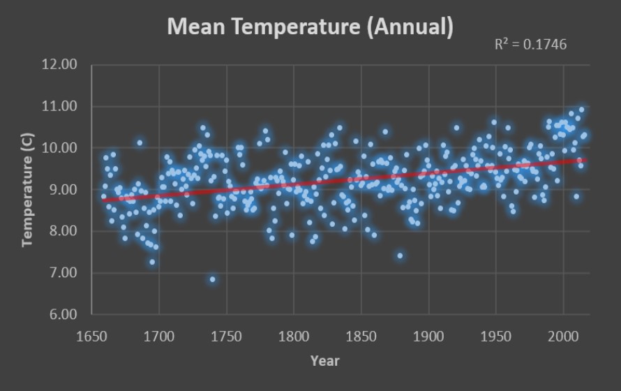
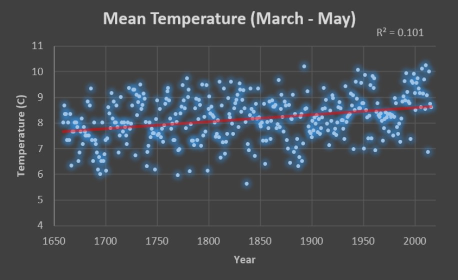
–Long-Term Temperature Trends– The mean temperatures being shown in the graphs below were collected as monthly mean temperatures by the United Kingdom Meteorological Office from 1659-2016 in the cities of London, Bristol, and Preston.
The variable plotted on the x-axis is the year the data was collected, and on the y-axis is the mean temperature that was recorded for that year. This was done in order to clearly show the trend when comparing temperature to the year associated with it, because if they swapped positions then it would be difficult to see the linear progression associated with such trend.
Verkest, D. (2020). Mean Temperature Annual [JPEG].Verkest, D. (2020). Mean Temperature Annual [JPEG].Verkest, D. (2020). Mean Temperature Annual [JPEG].
Based on the trend lines for the mean annual temperatures, mean Feb-Apr temperatures, and mean Mar-May temperatures, it appears that the mean temperatures for the last three hundred and seventy years has uniformly increased at a reasonably constant rate. This rate has been roughly one degree every three hundred years. The correlation coefficient (R2) represents how strong the relationship is between two variables. This relationship has a scale range of 0-1. The closer R2 is to 1, the stronger the relationship between the two variables. The graphs above all show their R2 in the top right corners. When comparing R2 between Feb-Apr mean temperatures and the Mar-May mean temperatures, we see that the Mar-May temperatures have the greater R2 value of 0.101. This implies that the data recorded forms a more related connection; hence a more correlated trend line is being shown.
Activity 2: Pollination of the Early Spider Orchid (Ophrys sphegodes) by the Solitary Bee (Andrena nigroaenea)
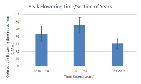
Like most symbiotic relationships between animals and plants, this one in particular involves the Solitary Bee pollinating the Early Spider Orchid. One of the main types of phenology is the flowering of plants and in this instance scientists gathered data from 77 species of the early spider Orchid during the time span of 1848-1958. Using this data along with field observations of Spider Orchids in a single population in the UK between 1975 and 2006, the scientists were able to determine the peak flowering dates for each year. By analyzing this graph you can see how there was been a trend in the fact that the peak flowering time at the end of the century has moved sooner to March 1 by around 3 days compared to the beginning of the century.
“Peak Flowering Time/Section of Years” Credit: Bo Nash
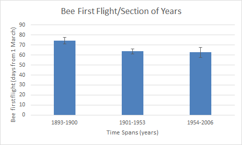
In order to see if there was a correlation between the first flight of the Solitary Bees and the flowering time, scientists and citizen scientist between 1975 and 2009. Researchers also examined specimens of Solitary Bees in the Natural History Museum in London in order to obtain a more comprehensive look at the data. The bar graph below shows the correlation between first flight and time span of years. The bar below also shows that in the last period of years it is shown that bees are having their first flight earlier than at the beginning of the last century.
“Bee First Flight/Section of Years) Credit: Bo Nash
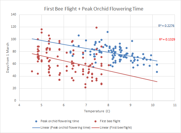
Although these two bar graphs are useful at showing individual data, the combined data is what we’re interested in. In the scatter plot below there is combined data points of peak orchid flowering time (blue) and first bee flight (red) vs. the mean spring temperature. At 7C the bees are first have their first flight before the peak flowering time. Compared to 10C when the Bees weren’t measured to have a first flight but the orchids were at peak flowering.
First Bee Flight + Peak Orchid Flowering Time compared to Temperature Credit: Bo Nash
After analyzing all of this information and looking at the graphs I can predict that if the global temperature continues to increase, the Early spider Orchid might miss out on the Solitary Bee’s first flight, seeing from the previous chart that there is not bee flight over about 8C.
Brood Awakening
After completing this lab and analyzing how phenology of organisms it has become easier to analyze current ecological situations and determine if there is a change in phenology involved. One such example has to do with the cicada outbreak and the earlier-than-usual presence of cicadas. Cicadas arrived in the North and Midwest of the United States in 2017 almost 4 years earlier than usual (Sheik). After analyzing the information in the research article and comparing it to our lab, there was a correlation. The increase in annual temperature caused the bees to have their first-flight significantly earlier. This was almost the exact same scenario as what happened with the cicadas. The increase in global average temperature caused the nymph cycle of cicadas to be altered, thus making them arrive four years earlier. Although this was an obvious pattern that could be depicted, another hypothesis to explain the cicada emergence in 2017 is that the internal clock in their brains could have been skewed by some environmental factor during reproduction.
Climate Change In Everyday Life
Climate change is considered the global problem of this generation. The possibility of a changed global environment and what that can induce is daunting and quickly approaching. The effects of climate change are already affecting the general public today. The fires in Australia are being attributed to a drought that is the result of the changing climate. The fire season is longer and precipitation is lower. (USA Today). The smoke from the fires is being carried into major cities and is causing the breathing air to become unsafe. Although this along with the increasing amount of heat waves per year are considered obvious effects of climate change, communicating it to the public is difficult. Americans are almost evenly split on climate related issues. 48% believe that climate change is due to human activity (Pew). This shows that the main challenge to communicate the general public about climate change is the current state of the public. People are more skeptical than ever and a lot ignore scientific data even thought that is considered fact. In order to communicate the fact that climate change is real we as science communicators need to show that there is a direct correlation between the heatwaves, the fires, and the floods that everyday people are experiencing is caused by climate change. The effects of climate change are far reaching and even effect the basic necessity for all life: water. This is shown in the following publication:
Peer Review Citation: Baba, A., & Baba, A. (2011). Climate Change and its Effects on Water Resources: Issues of National and Global Security. Place of publication not identified: Springer.
Credits
Bo Nash: “Experiment Summary”, “Activity 2” information and graphs, “Climate Change in Everyday Life”
Derik Verkest: “Activity 1” information and graphs, “Brood Awakening”
Siren, A., Nowak, J., Bryan, A., Ivan, J., Zimova, M., Sirén, A., … Morellato, P. (2019). Local climate determines vulnerability to camouflage mismatch in snowshoe hares. Global Ecology & Biogeography. https://doi.org/10.1111/geb.13049
–Introduction– Life stages of animals are dependent on periodical environmental factors. This can include temperature, precipitation, and amount of daylight. As climate change continues to occur, these specific environmental events that animal life stages are evolved around will continue to change. For example, places that have specific rainy seasons also have animals that depend on those heavier periods of rainfall, and if those periods stop dropping the amount of rain needed to trigger these life stages then selective pressures are going to act on those animals. The same goes for factors such as temperature. If the temperatures for areas such as a tundra begins to increase, then the plants and animals adapted to the colder temperatures are going to start having environmental fitness issues. A secondary effect of this phenomenon is called ecological mismatch. This occurs when the life cycle of one organism is disturbed because it depends on the life cycle of another organism that had its environmental cues shifted by climate change. For example, animals that molt their coats to a white color in the winter to match the snowy background depend on sunlight cues to change their coat colors, however as climate change keeps snow off the ground longer, these animals then become color mismatched against the still dark background. Field research has shown that these coat color mismatches have increased predator-induced mortality (Siren et al. 2019).
–Long-Term Temperature Trends– The mean temperatures being shown in the graphs below were collected as monthly mean temperatures by the United Kingdom Meteorological Office from 1659-2016 in the cities of London, Bristol, and Preston.
The variable plotted on the x-axis is the year the data was collected, and on the y-axis is the mean temperature that was recorded for that year. This was done in order to clearly show the trend when comparing temperature to the year associated with it, because if they swapped positions then it would be difficult to see the linear progression associated with such trend.
Verkest, D. (2020). Mean Temperature Annual [JPEG].Verkest, D. (2020). Mean Temperature Feb-Apr [JPEG].Verkest, D. (2020). Mean Temperature Mar-May [JPEG].
Based on the trend lines for the mean annual temperatures, mean Feb-Apr temperatures, and mean Mar-May temperatures, it appears that the mean temperatures for the last three hundred and seventy years has uniformly increased at a reasonably constant rate. This rate has been roughly one degree every three hundred years. The correlation coefficient (R2) represents how strong the relationship is between two variables. This relationship has a scale range of 0-1. The closer R2 is to 1, the stronger the relationship between the two variables. The graphs above all show their R2 in the top right corners. When comparing R2 between Feb-Apr mean temperatures and the Mar-May mean temperatures, we see that the Mar-May temperatures have the greater R2 value of 0.101. This implies that the data recorded forms a more related connection; hence a more correlated trend line is being shown.
–References– -Siren, A., Nowak, J., Bryan, A., Ivan, J., Zimova, M., Sirén, A., … Morellato, P. (2019). Local climate determines vulnerability to camouflage mismatch in snowshoe hares. Global Ecology & Biogeography. https://doi.org/10.1111/geb.13049
An understanding of how scientists convey their works to the public
By: Derik Verkest and Bo Nash
Communication between scientists and the public is an essential part of the work that scientists do. Without informing the public on scientific discoveries the public will remain ignorant that there have been fascinating and even groundbreaking ideas and experiments that change the way we see the world. This is where science communication comes in, which is what this page is about. We will explore the definition of science communication and show you some of the mediums scientists can use to relay their information to the public.
Throughout this blog post we will provide examples and of science communication and even the essence of what science communication is and does. In order to more directly address these needs this post will be in a Q&A format in order to hopefully provide clarity on the questions being asked and the answers being provided.
What is Science Communication?
What is science communication according to the presenters? How does it differ from Monica Feliu-Mojer’s definition of science communication?
Why is science communication important to researchers and the general public?
How does science communication differ from scientific dissemination? Why is each important?
According to Rhonda Smith science communication “is about communicating to non-experts”. She enhances this definition by saying that scientists cannot stay in their “ivory towers” and just talk to other experts, they need to communicate with experts from other fields and non-science experts as well. This differs from Monica’s definition because Rhonda says science communication is a middle ground between experts and non-experts while Monica defines it as “any activity that involves one person transmitting science-related information to another”.
Scientists must communicate to the public because, as Alexandra Ruete says, “you need to sell what you’re doing”. This means that the scientists need to show the public, who paid for their equipment and labs through taxes, that their payoff is worth it and working.
“Dissemination is their day job…It’s about the production of papers that can be presented to peer-reviewed journals so they can get published”. This differs from communication because instead of disseminating the information communication is “to inform and reach out to society”.
Alan Alda: Science Communication
According to Alda, “Everyone is too ignorant about science. That is what science is about: Science is about satisfying the ignorance we all naturally possess.” What do you think Alda is trying to convey in this statement about the role of the scientist and the general public? What challenges do you see with this type of engagement?
How might you design your blog to reflect the aims of science communication?
I believe that Alda is trying to convey that scientists should put the communication of their findings to the public as their top priority because that is what science is about, it’s about discovering new things and changing society with that discovery. This engagement faces the problem of common ground. This means that scientists have to “translate” their very complicated and sophisticated wording that is needed in the science community to terms that the population as a whole can understand.
This blog will aim to do just that. To provide as a translation from the scientific results that we will find in this lab to terms that the public can understand. This communication will also aim to educate the public on the matters of ecology and how it is affecting everyday lives not only in humans but in plants and animals too.
Reflection on Monica Feliu-Mojer’s ‘Effective Communication, Better Science’ By Derik Verkest
Monica Feliu-Mojer defines science communication as communicating scientific language in a simplified and more effective manner in order to get what’s being learned in research across multiple fields of study, as well as making it understandable for whatever audience you happen to be targeting. I’ve used scientific communication while visiting my in-law’s farm when I noticed that they had a pond that was severely eutrified. I felt that the eutrophication process would be too much to explain for the audience I was addressing, as they were multi-generational farmers with no education. Therefore, I simply explained that the runoff from the cattle barn was carrying their fecal matter into the pond, making it too rich in nutrients, and that it inevitably killed off all the fish and wildlife that may have been present before. They understood the implications immediately and ended up cleaning the pond up and redirecting the manure runoff. Scientific information alone isn’t sufficient enough to benefit rural farmers unless it is further processed, simplified and effectively communicated to reach a wide audience (Heong & Escalada, 2005).
Effective communication is important to science because it helps the communication process between multiple disciplines of work, which in turn helps both scientists and non-scientists because information can be shared more proactively between the two, allowing new innovation and collaboration to occur. For example, if a scientist can effectively communicate a scientific concept to an entrepreneur it could spark an idea within that individual for a new invention that may solve a global or local issue.
As a science student, the most challenging part about science communication is simply learning the scientific language. However, once I become proficient in the language of science, I could see myself benefiting from science communication through some of my future aspirations. For instance, I’m going to start a homestead in a rural area growing organic food, and one of my major goals is to spread the knowledge of sustainable agriculture to the rest of the farming community around me and start a farmers market. This will help keep the land clean and sustainable, as well as help to combat the food deserts that often plague rural communities. All of this, however, balances on whether or not I can effectively communicate the science.
Review of ‘It’s Okay to be Smart’ By Derik Verkest
After going through the ‘It’s Okay to be Smart’ blog it’s apparent that this is a very strong blog in effectively communicating science to a general audience. Using videos is probably its biggest strength, as listening to someone talk and having visuals is a much better way to learn about a scientific topic. Joe also does a good job at using animations as visual representations of complex ideas and information. One weakness I noticed is that there is very little context outside of the videos. The videos are great for the quick, to-the-point type of audience, but there should be more in-depth text for the more scientifically inclined audience.
Some video titles that were the most visually appealing to me were the ones with the night sky as a thumbnail along with the title of the video being in big letters across the thumbnail, because I love space and it’s easy to see the title when it’s in big bold letters that pop out at you. I watched the ‘What’s in a 20,000 Year-Old Cube of Ice’ and ‘Is This Why We Haven’t Found Alien Civilizations?’ videos. In these videos Joe does a great job in starting the conversation with a little background, and the further use of animations to show how a Mass Spectrometer separated isotopes and how scientists use light to measure the atmosphere on other planets was a really great example of effective science communication.
With my blog I want to do something similar to Joe’s animations of explanation. Even though I probably won’t use video, I plan on using GIFs and visually appealing graphs and pictures as a similar tactic in communicating the science in my blog. Also, just like Joe, I want to have good background explanations of the science being done prior to diving into the actual research and data.
For further inquiry in science communication and how it works, see the peer review citation below of an article that discusses and explains how science communication works.
Peer Review Citation: The science of science communication II : summary of a colloquium : held on September 23-25, 2013 at the National Academy of Sciences in Washington, D. C. (2014). Washington, District of Columbia: National Academies Press.
EU Science & Innovation. “What Is Science Communication?- The EU Guide to Science Communication.” Youtube, Youtube, 8 Feb. 2017, www.youtube.com/watch? v=4E8rXg3Nv7U&feature=youtu.be.
Luen Heong, K., & Escalada, M. (2005). Scaling up communication of scientific information to rural communities. Journal of Science Communication, 04(03). https://doi.org/10.22323/2.04030302
This is the first post on my new blog. I’m just getting this new blog going, so stay tuned for more. Subscribe below to get notified when I post new updates.
This is an example post, originally published as part of Blogging University. Enroll in one of our ten programs, and start your blog right.
You’re going to publish a post today. Don’t worry about how your blog looks. Don’t worry if you haven’t given it a name yet, or you’re feeling overwhelmed. Just click the “New Post” button, and tell us why you’re here.
Why do this?
Because it gives new readers context. What are you about? Why should they read your blog?
Because it will help you focus you own ideas about your blog and what you’d like to do with it.
The post can be short or long, a personal intro to your life or a bloggy mission statement, a manifesto for the future or a simple outline of your the types of things you hope to publish.
To help you get started, here are a few questions:
Why are you blogging publicly, rather than keeping a personal journal?
What topics do you think you’ll write about?
Who would you love to connect with via your blog?
If you blog successfully throughout the next year, what would you hope to have accomplished?
You’re not locked into any of this; one of the wonderful things about blogs is how they constantly evolve as we learn, grow, and interact with one another — but it’s good to know where and why you started, and articulating your goals may just give you a few other post ideas.
Can’t think how to get started? Just write the first thing that pops into your head. Anne Lamott, author of a book on writing we love, says that you need to give yourself permission to write a “crappy first draft”. Anne makes a great point — just start writing, and worry about editing it later.
When you’re ready to publish, give your post three to five tags that describe your blog’s focus — writing, photography, fiction, parenting, food, cars, movies, sports, whatever. These tags will help others who care about your topics find you in the Reader. Make sure one of the tags is “zerotohero,” so other new bloggers can find you, too.